Squirrel: Designing and Documenting an AI-Assisted Mobile Design System
I designed and documented a mobile design system with ChatGPT and Figma: foundations, components, patterns, and interactive prototypes.
- Role
- UX designer
- Tools
- ChatGPT, Figma Design, Figma Make
- Accessibility
- WCAG 2.2 AA across foundations, components, and patterns
1. Overview
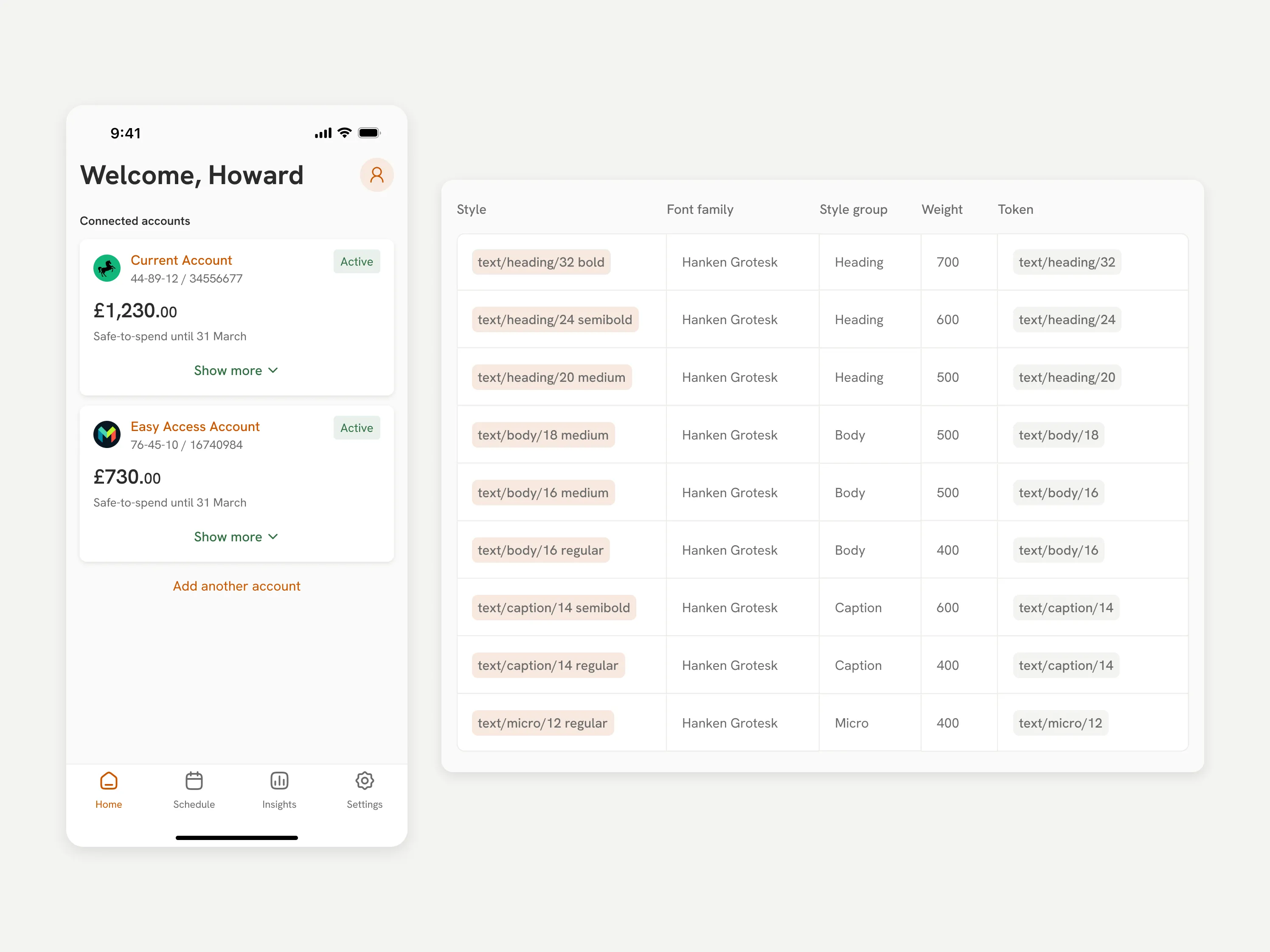
Squirrel started as a test: could AI actually help build a design system, not just mock up screens? Instead of running research or usability testing, I focused entirely on the system itself: foundations, components, patterns, and accessibility guidance.
I used AI throughout to explore system structures, draft early layouts, and support documentation, then refined everything by hand to keep it consistent and aligned with fintech standards.
The result is a fully documented mobile design system, backed by application screens and interactive prototypes that show how it behaves in practice.
- Documented mobile design system
- Structured foundations, components, and patterns
- 50+interface screens demonstrating system usage
- 3interactive prototype flows
- WCAG 2.2aligned accessibility guidance
2. Project background
Product context
Many budgeting tools assume users have stable income and predictable spending patterns. In reality, financial behaviour is often inconsistent, and users need quick, reliable answers to immediate spending decisions, not long-term projections.
Squirrel focuses on a single metric: the Safe Spending Balance, a real-time view of how much a user can safely spend once upcoming bills and commitments are accounted for. It’s a shift from financial forecasting to short-term clarity.
Project framing
To explore this, I simulated the design process for a fintech product, focusing on the stages needed to go from problem definition to a working system.
Outcome of the approach
The most valuable outcome turned out to be the design system itself, backed by detailed documentation.
Early work on foundations (colour, typography, spacing, component structure) shaped everything that followed, and I applied those consistently across components, patterns, and screens.
3. The idea behind Squirrel
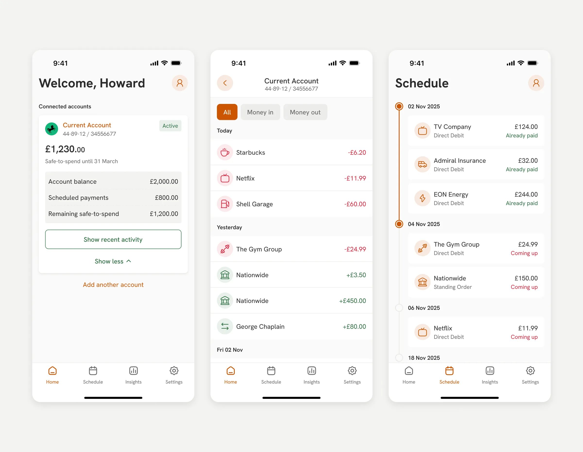
Squirrel prioritises short-term financial clarity over traditional forecasting. Instead of asking users to interpret projections, it gives them one actionable view of their financial position: the Safe Spending Balance, backed by recent activity and scheduled payments for context.
That turns the task from analysing data into making a decision. Users get a clear, continuously updated number instead of having to work one out themselves.
The interface reflects this: key information sits upfront, with supporting detail revealed progressively to keep things simple without hiding anything.
 Open the full-size image
4. Using AI to build the design system
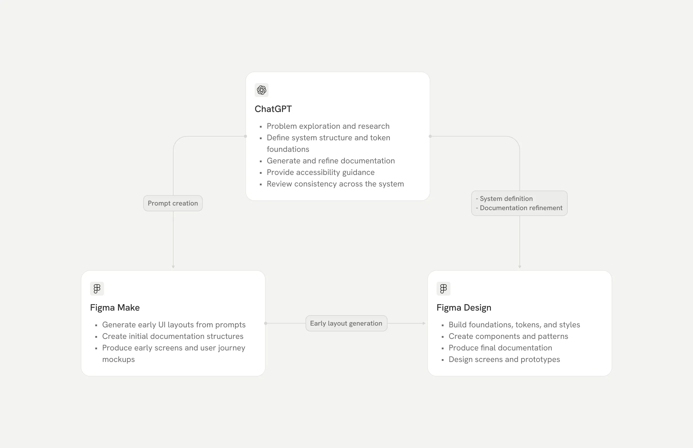
I used two tools throughout: ChatGPT for product exploration and system thinking (drafting design system structures, variables, and documentation content, and refining language and accessibility considerations), and Figma Design and Figma Make to turn those ideas into layouts, components, and prototypes.
The usual sequence was: draft prompts in ChatGPT, generate first-pass screens and documentation in Figma Make, then refine everything by hand in Figma Design for consistency and usability.
The workflow was iterative, not automated. AI sped up exploration and early drafts, but I made every final call myself to keep quality and coherence under control.
 Open the full-size image
5. Foundations
The first step was defining the foundational rules of the interface: the visual and interaction primitives everything else builds on.
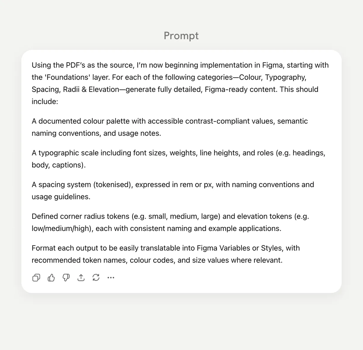
I used AI to explore initial structures for tokens, styles, and accessibility considerations, then refined them by hand.
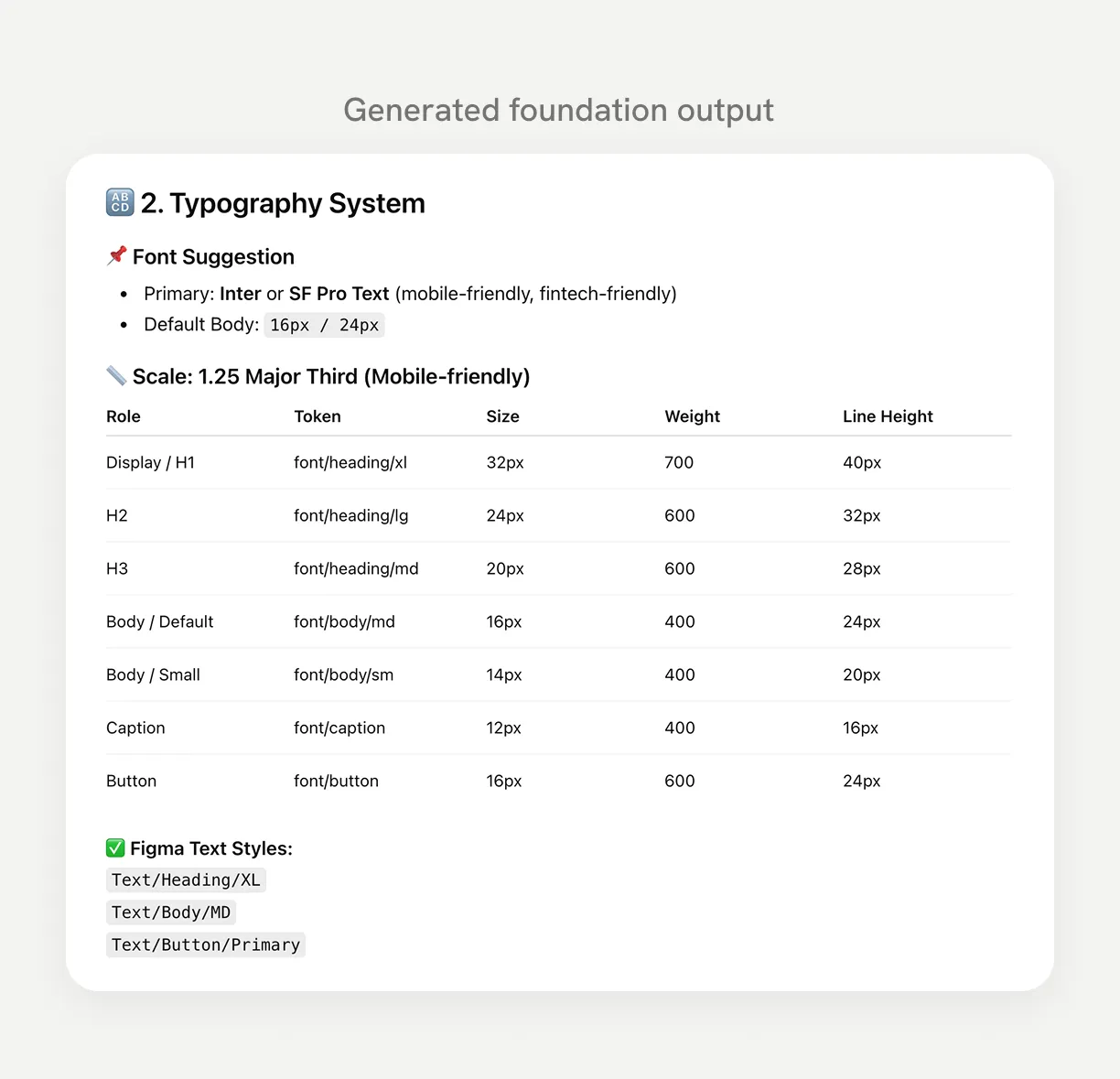
The foundations cover colour, typography, brand, spacing, radius, elevation, and tone of voice, each combining tokens, styles, usage guidance, and accessibility principles.
Foundations in practice
- Colour defines brand, neutral, and status palettes with clear contrast guidance.
- Typography establishes hierarchy across headings, body text, captions, and microcopy.
- Brand defines how visual identity and tone are expressed across the interface.
- Spacing ensures consistent layout rhythm and accessible touch targets.
- Radius and elevation define surface hierarchy and component structure.
- Tone of voice ensures clarity, consistency, and accessibility in content.
Accessibility is built into these foundations directly: colour contrast, text readability, and touch target spacing, not treated as a separate layer.
6. Components
With the foundations in place, the next step was building the reusable components: the actual building blocks of the interface.
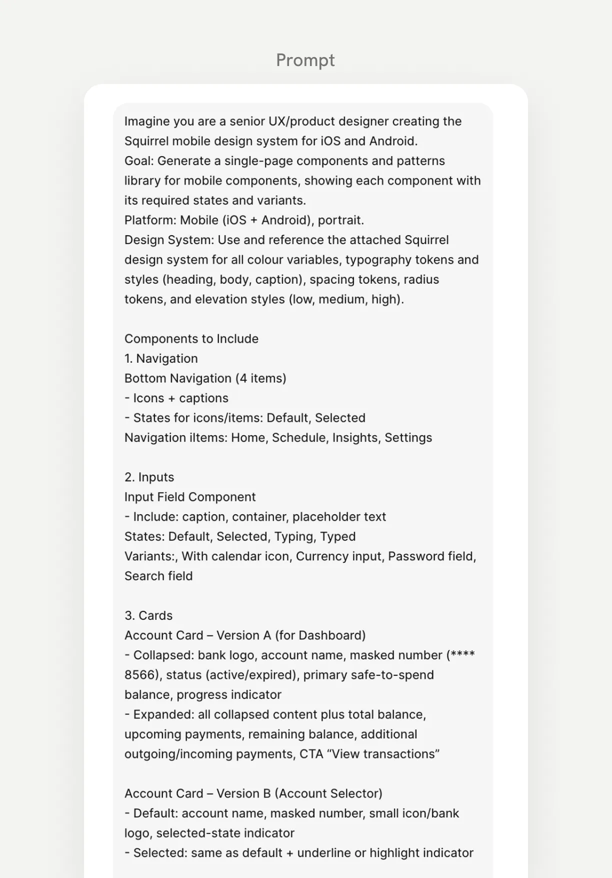
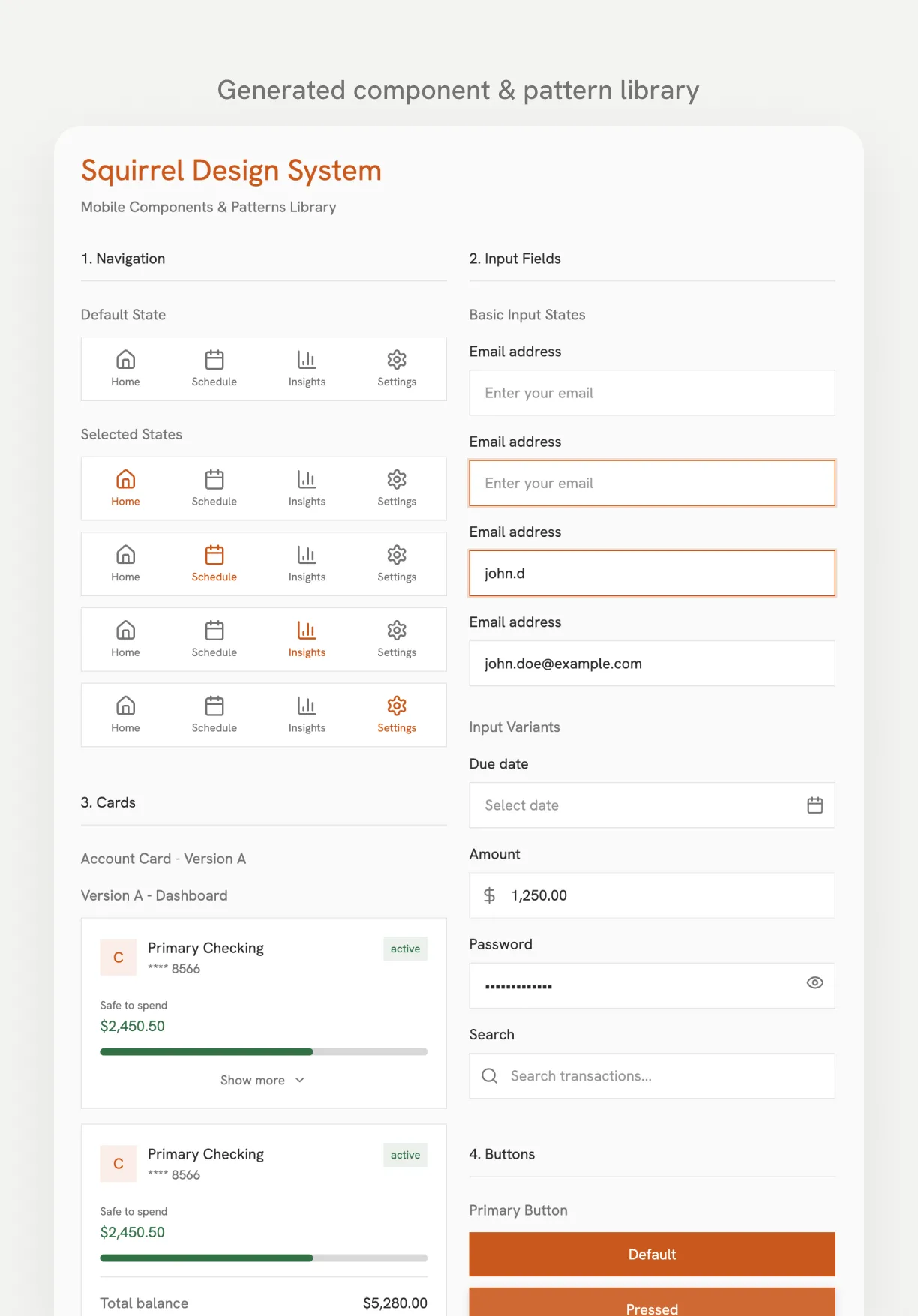
I used AI to generate an initial component library in Figma Make, covering both components and the patterns they support, then refined the outputs into a structured, documented system.
The library includes core elements such as buttons, input fields, switches, icons, badges, and alerts, built for consistent reuse across the product.
Component structure
Each component is documented the same way: purpose and usage guidance, anatomy, variants and states, content guidelines, and accessibility considerations.
7. Patterns
While components are reusable UI elements, patterns are how those components combine to solve recurring interaction problems, like navigation bars, top app bars, segmented controls, lists, and cards.
I developed these alongside the components rather than separately, refining both together as part of the same system design process.
Pattern structure
Each pattern is documented with purpose and usage guidance, anatomy diagrams, configurations, behavioural rules, and accessibility considerations.
8. Accessibility
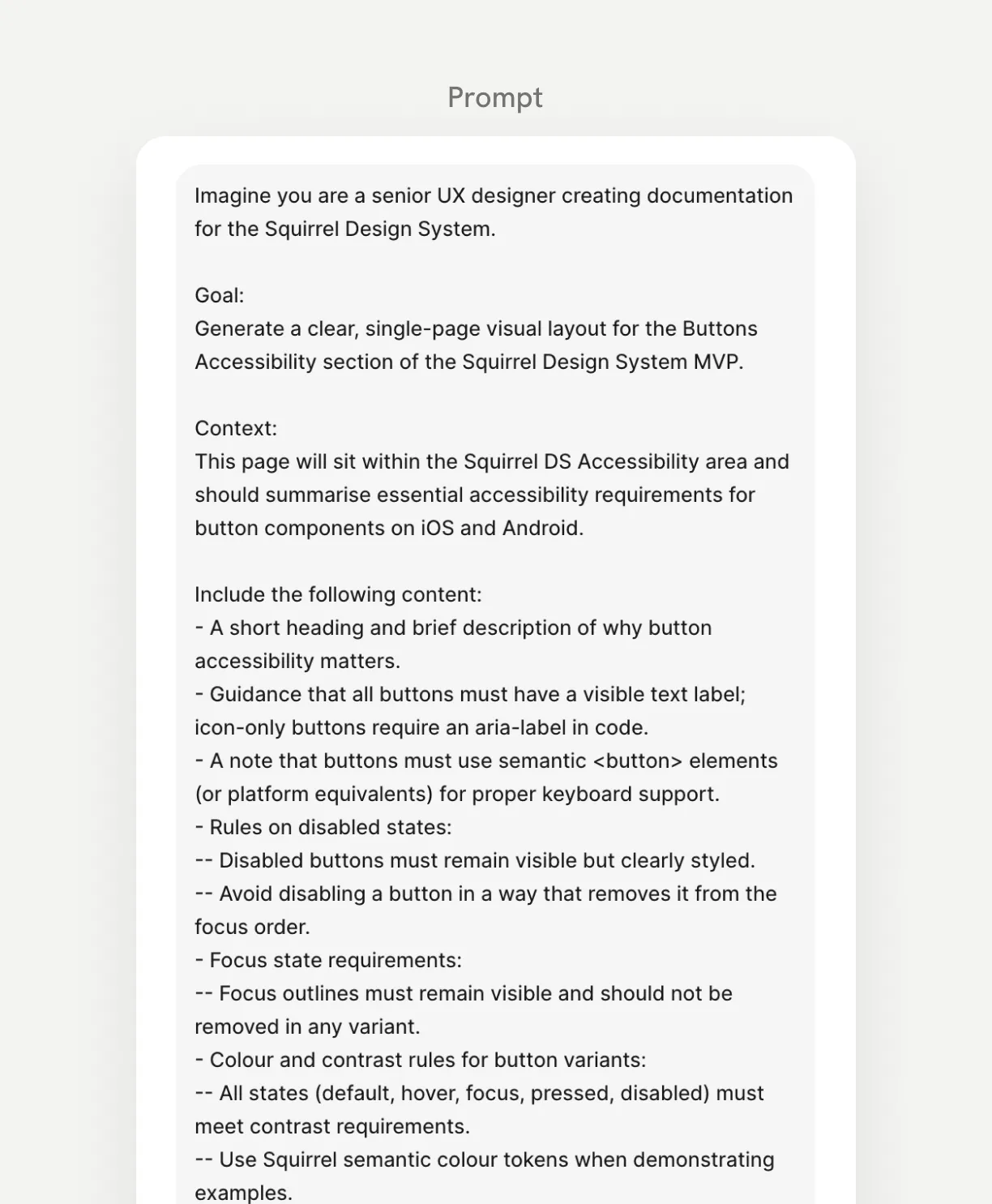
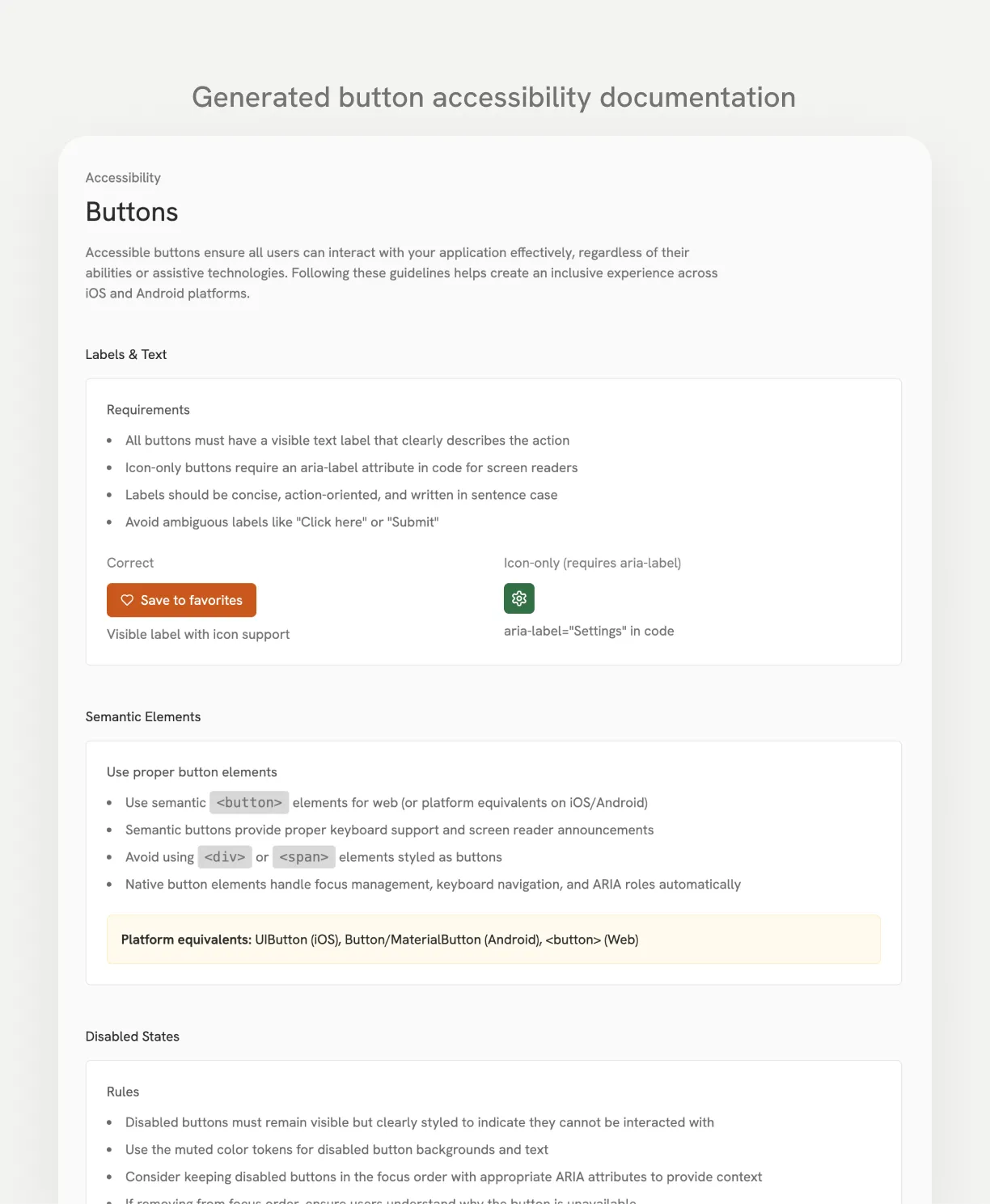
Accessibility is a core part of the design system, not a requirement bolted on later. Squirrel targets WCAG 2.2 AA across foundations, components, and patterns.
Foundations handle colour contrast, typography readability, and touch target spacing. Components define semantic roles, keyboard behaviour, and screen reader support. Patterns handle focus management, interaction hierarchy, and predictable navigation.
I used AI to explore early accessibility considerations, then refined them into structured documentation.
9. Applying the system to the app screens
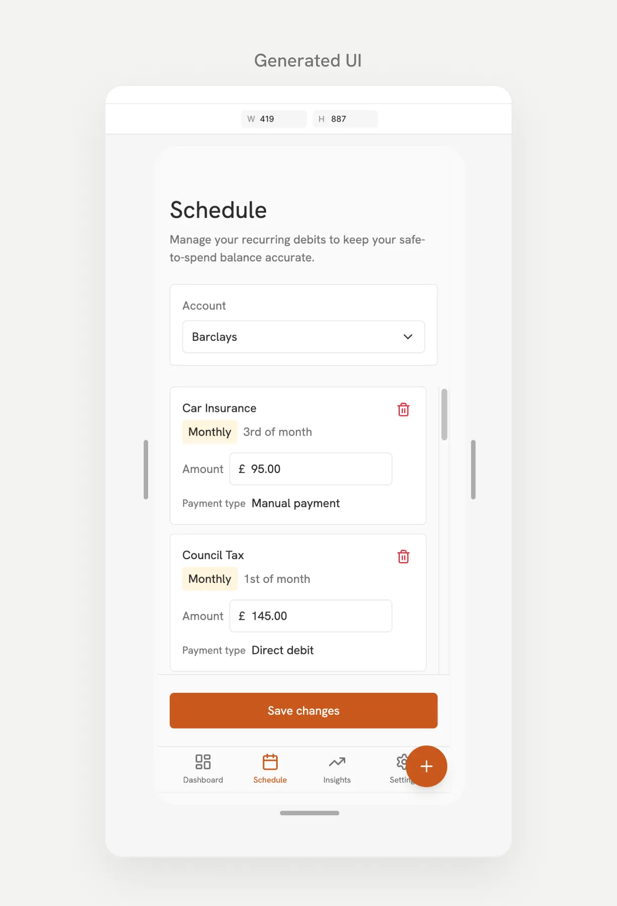
With foundations, components, and patterns defined, I applied the system to build actual screens: not a complete product, but proof of how the system behaves in real use.
I developed layouts iteratively, using the approved components and patterns and following the accessibility and brand guidance already established.
Key screens
- Onboarding and bank connection
- Dashboard and safe-spending overview
- Activity history and scheduled payments
- Settings and security
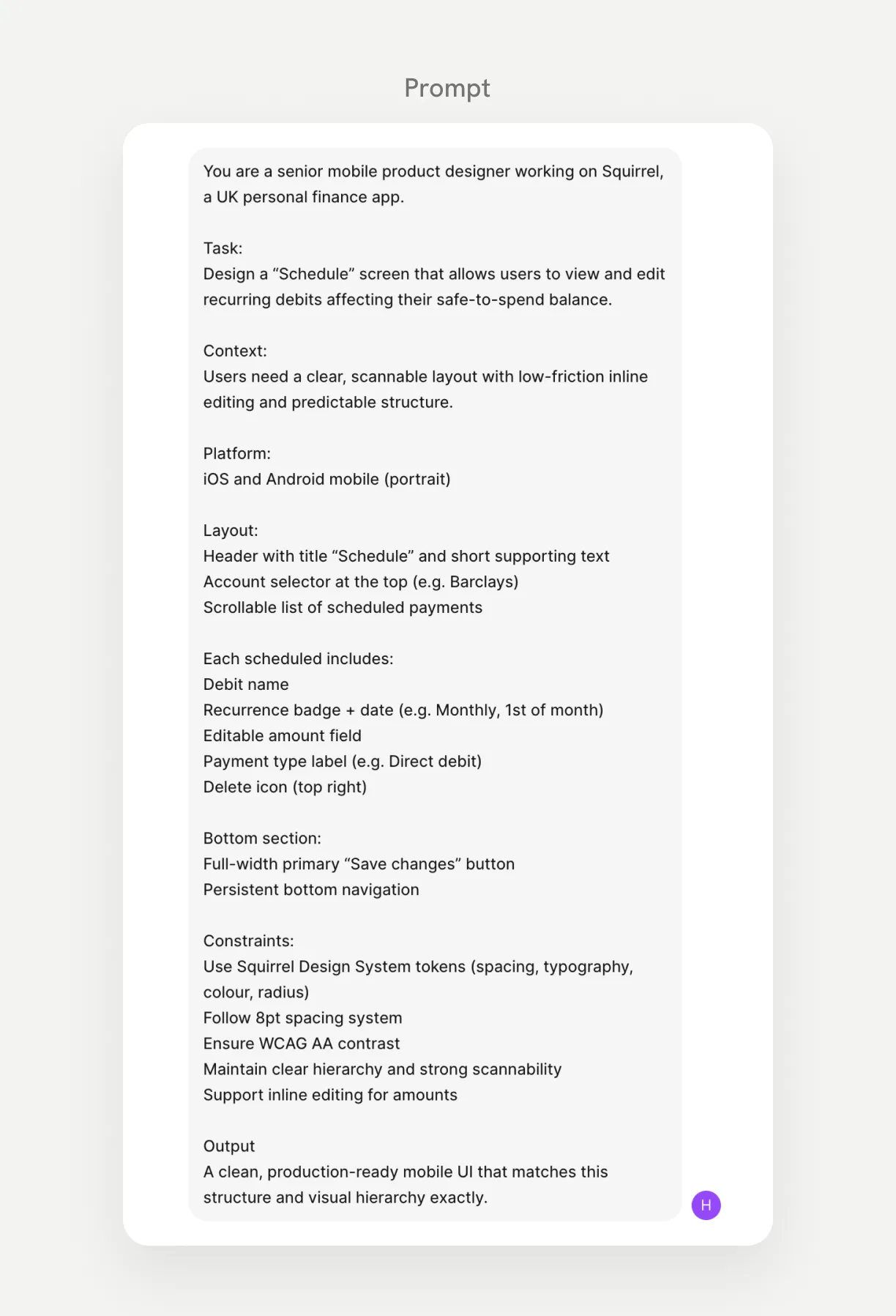
Early layouts were generated from structured prompts in Figma Make, then refined in Figma Design.
10. Prototyping and interaction design
I built interactive prototypes to show how the interface behaves across three key journeys:
- Account onboarding and bank connection
- Understanding the safe-to-spend balance
- Account settings and security management
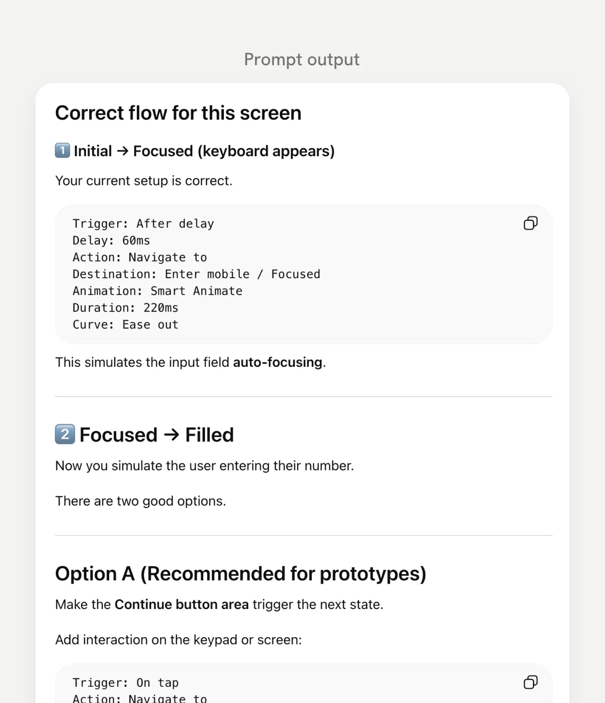
I used AI to explore transition patterns, then implemented and refined them in Figma. Motion needed to feel calm and predictable, so transitions stay subtle and functional: guiding attention rather than adding visual noise. Bottom sheets, gentle transitions, and progressive disclosure keep financial information clear and timed to when users need it.
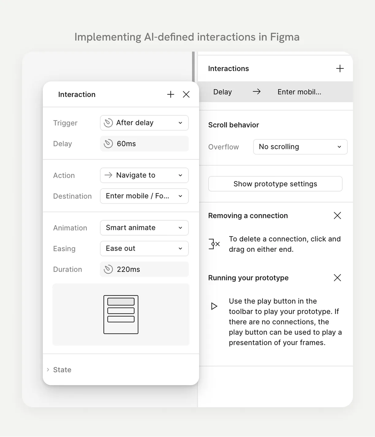
Prototype 1 - Account onboarding & bank connection
Users securely connect their bank account, so Squirrel can analyse balances and upcoming payments and calculate a personalised safe-to-spend amount.
Prototype video coming soon
Prototype 2 - Understanding safe-to-spend and upcoming payments
Squirrel combines account balances with upcoming payments so users can see what they can safely spend, alongside recent activity and future bills.
Prototype video coming soon
Prototype 3 - Account settings & security
Squirrel keeps account management and security simple: users can update personal information and manage access safely.
Prototype video coming soon
11. Key Learnings & Outcomes
This project showed me that a small set of AI tools, used intentionally, can support building a large, structured design system. ChatGPT and Figma let me explore system structures, define components, and shape documentation quickly, but the final system still came down to my own judgement and attention to detail.
It also reinforced how much system thinking matters in my process. Defining foundations, components, patterns, and accessibility guidance early gave the rest of the work a clear framework, and made it faster and more consistent.
That’s how I use AI in practice: not to replace design thinking, but to speed up how I explore ideas, structure systems, and document the results.